Friday, July 8, 2011
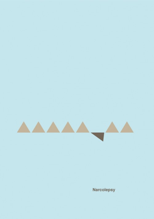
7 minimalistic posters representing various mental disorders - 22 Words
I've been neglecting my blog lately! Summer, one would think, would mean an abundance of time to devote to blogging and other such ventures, but somehow, that time ends up getting spent doing other things...specifically, being lazy.
Anyway, I'm back! And hopefully the rest of the summer will bring some more posting.
This post, at any rate, is just to share this page that I just stumbled across. These minimalistic posters are really amazing. Simple, poignant, and communicative. Minimalism at its best!
Wednesday, April 20, 2011
 I'm taking a short break from work on a painting for class (due tomorrow! Yikes!), and I thought I'd come share a few things that I've been learning and working on lately. Namely, painting with encaustic.
Our last project in painting was to paint a small panel with encaustic. For those of you not familiar with the term, encaustic is basically painting with hot wax. It's mostly beeswax and pigment, and can give some really vibrant, beautiful colors. It's a very different medium, though, from anything else I've worked with, and it was really fun to experiment with it.
 When painting with encaustic, you have to keep all the paints in liquid form by keeping them hot, so all the pots of color are kept on hot plates or griddles, and when you paint with it, it sets up very rapidly, since as soon as it begins to cool, it hardens and becomes more opaque. That being the case, you have to work pretty fast. What is fun about it, too, is how easily it takes to things like collage, transfer, and building up texture or layerss. You can incise lines into thick layers of wax and fill them with color, you can scrape away layers to reveal what's underneath, or you can attach globs of warm wax to build up semi-sculptural aspects on a piece.
The pieces we did were small, and mostly, I believe, just for the experience of working with the new medium, but it was really fun to play around with. People who know what they're doing with the medium can really do some cool things with it, too. It's also interesting to note that encaustic is incredibly archival and will last for incredible lengths of time as long as it is not exposed to enough heat to melt the wax. We know it has been in use since the time of the Ancient Egyptians, who used it to create mummy portraits. Cool!
I didn't get far enough with my encaustic practicing to figure out how to deal with representational imagery with it, though I think it would be fun to try it. However, I found the website of Kevin Frank earlier today and was amazed at what he is able to do with this fun (but tricky) medium. Take a look at a few of his paintings!


Pretty amazing, no? I was very impressed, especially after having worked with encaustic a little myself.
Anyway, I enjoyed the exercise and have a new respect for artists of Ancient Egypt -- and all other time periods that came before electric griddles and heat guns -- who managed to paint what they did with this medium!
Wednesday, April 13, 2011
Art enables us to find ourselves and lose ourselves at the same time. -Thomas MertonI just began reading a book called Art & Fear: Observations on the Perils (and Rewards) of Artmaking, and even as little as I've read so far, I've really enjoyed it. It has already made some very good points. For instance, it talked about the struggle in continuing in art, and not quitting. They rightly recognize the fear behind most instances of quitting. Basically, it's a fear of failure. That's common. It's human. But it's also dangerous.
We allow fear to stop us from accomplishing anything. We let ourselves get distracted by what's going on around us. We become discouraged when other people are doing better than we are. We call it an inability to comply with deadlines or to work under certain conditions, or sometimes we simply contribute it to laziness, but what it boils down to is a fear of failure. The book makes a very good point about this -- one which I've recently come to realize myself as well: that when we label ourselves as artists, we identify ourselves with our art, and therefore, a bad piece of art translates to mean that we are bad artists. We become so closely identified with what we are creating that if once we fail, it instantly means we are a failure. But that's not true!
As a young artist, still trying to figure out what I have to say and where I'm going with all of this, I am right there in the middle of a lot of what this book is saying so far. Basically, art is scary. It makes you vulnerable. Creating art is like opening up a bit of your soul for people to look at, examine and criticize. It's a bit unnerving sometimes if you are still figuring things out. But that's part of what makes it so exciting. It really is an adventure!


%5B2%5D.jpg?imgmax=800)
Labels:
art,
art and fear,
Artist,
Beatriz Milhaze,
Continuing,
Don't quit,
Painting,
Rob Hefferan,
Roi James,
Victor Wang
|
 0
comments
0
comments
Tuesday, April 12, 2011
Artists don't get down to work until the pain of working is exceeded by the pain of not working. - Stephen DeStaebler
I did warn you that my "sketch of the day" was not likely to be a daily thing, and you can't say I didn't tell the truth. But I'm not giving it up completely! I have a sketch for you today, and I also have some clay projects to share as well.


These are just some scans of pages from my sketchbook where I was sketching people unawares. I have a friend who calls this "Ninja sketching." I think that pretty much sums it up. They're just loose, gestural drawings, trying to catch the impression of someone before they move -- or worse, discover that you're drawing them. *Gasp*
But as I mentioned, I'd also like to share a few of my current clay projects. They're still in the works, because they are all unglazed currently. I'll just give you a little peak into the in-progress works, and hopefully by the end of this semester, they will all be nicely glazed and I can show you the finished product.
As usual, click to enlarge.


I'm enjoying clay. It's a fun medium. Messy, and a very fast-paced class, but fun.
Monday, April 11, 2011
Hello there! Happy Tuesday. I hope your day was pleasant. Mine was pretty good. Less productive than it should have been, but oh well, it happens. I was struggling with ideas (or rather, the lack of any idea at all) for my drawing project during class today and didn't get much work done as a result, but I think I've come up with something interesting now. Stay tuned to see if it pans out. I'll wind up posting about it in a week or so when it's done, I'm sure.
Ok, well time to continue from the last post. There are still several more paintings in the series!
Let's jump right in.


Ok, well time to continue from the last post. There are still several more paintings in the series!
Let's jump right in.
NUMBER FIVE:

For this one, I took the idea of roses from the last one, and combined it with the rectangular shape of the cards, but in a very different way. I used splatters and broad strokes of watered down paint first, letting it drip down the canvas as it would, then collaged on rectangles torn from some scrap fabric I had lying around to create the background. Then, using the flexible modelling paste mixed with some red paint, I created little roundish, rose-shaped dollops, which I highlighted with white paint to add some needed clarity to them. I then dragged some green (mixed with modelling paste) down from them with the palette knife for emphasis on the stems. That flexible modelling paste stuff is quite fun.
NUMBER SIX:

Well, after looking at the rectangles from the last one, I felt like it looked kind of like a skyline, so I decided to paint this one about a city -- lots of rectangular building shapes. To continue with the rose theme, I stretched some faintly floral-patterned fabric onto the canvas first, then painted a very rough, loose impression of a city (Venice) from a picture on an old postcard. I used some thicker paint and modelling paste with a palette knife to finish off the parts I wanted to come forward a little.
NUMBER SEVEN:

After that, I decided to use the post card from which I had taken the scene of the last painting. I also had some other post cards, most of them somewhat antiqued, which I had gotten from another student who had brought a huge box full of them to share. I liked this idea of travel and communication, so I collaged on the post cards, used pouring medium over them, and floated some old stamps (from left over post cards) and some antiqued lace into the surface.
NUMBER EIGHT:

Well, the whole time I was working with the post cards, I kept wondering about the relationships between the senders and recipients of the cards. Invariably, I wondered if there was any romantic connection between them, or if there had once been. Maybe I've just seen too many romantic movies or something, but it just seemed like such a beautiful idea. So I started thinking about love letters, and this is what came of it. The background is made up of some printouts of antique letters (in French, I believe, though the words are now so obscured that they are illegible) in lovely, sweeping calligraphy. I thought they were quite elegant. Then I painted this lovely figure over them. She was quite difficult for me, actually, as the reference I was using was very small and indistinct, and I struggled against my urge to want to make her very precise and realistic. I wanted her to be left somewhat loose and indistinct, a little painterly, yet at the same time clear. I felt it added to the "romance" of the picture. I'm...at least decently pleased with her in the end. Finally, I tied a bow with twine around the canvas, like a package to be sent to someone.
NUMBER NINE:

The final, and my least favorite, this one came from the idea of communication, and how it has changed over time. Letter writing is kind of a lost art these days. Unfortunately, I was kind of in a hurry by the time I got to this one, and I had really struggled for a decent idea for it. So I just collaged on logos and images from popular communication methods of today -- internet, phone, etcetera. Then over the top, I placed an antique letter, similar to the one in the background of the previous painting. Over that, I sketched an inkwell and pen in charcoal. Like I said, it's my least favorite, but it's acceptable, I suppose.
So there you have it!
On another, totally random note, I cut my hair! (I know that seems really mundane, but I cut it super short, and it's a rather drastic change, so I felt the need to say something about it.) It's a pixie cut now! I'm loving it.


Labels:
art,
communication,
correspondence,
haircut,
Love,
love letters,
Painting,
post cards,
romantic,
small paintings
|
0
comments
Thursday, April 7, 2011
Phew, it's been a crazy week or so. Projects had piled up on me and I wasn't able to get around to sharing! But thanks to one of those projects, at least, I have some fun things to share with you, readers. One of the projects that had me so busy was a painting project for which we had to paint nine small, 1'x1' canvases or framed panels. Going into it, I was concerned by the number of them, and the rather short time we had to finish the project. However, it is now one of my favorite projects we have done. I feel like I learned quite a bit, and really had some fun playing around with things that I've never been brave enough to try before.
The assignment required that for the first small painting, we started by responding to a part of our last painting (for me, that was the large Janet Fish still life). For the second painting, we responded to the first small one in some way; for the third, we responded to the second, and so on and so forth, so that it was like a visual game of telephone in a way. My final series wound up looking a little bit on the random side, the connections being more conceptual than visual, but that's okay with me. I wanted to use the project to experiment and stretch myself. I wanted to try new things and play around with mediums.
I painted all of them using acrylics and acrylic mediums, which in itself was a stretch. I've gotten so comfortable with oils that going back to acrylic was a little irritating at times. I really wanted to play with the various acrylic mediums that our professor had shown us, though, so it was worth it to me to put up with the acrylic paint in order to allow for the experimentation!
So, enough talk, let's get down to it! The first few paintings in the series:
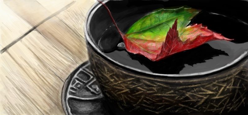
NUMBER ONE:

This first one I took from the section of the larger painting with the little tea cups. I painted it as representationally as I could, but left out the purple, swirly shadows from the first layer. Once it had dried, I went back in with acrylic pouring medium (cool stuff!) and poured a thin layer of that over the whole thing. I left that to dry overnight. The next day, I poured a second layer of pouring medium, and into it I swirled watered down purple paint in this swirly pattern. So there's actually a little depth between the layers thanks to the pouring medium that's not entirely visible here. Also, the bright white shine is due to the pouring medium.
NUMBER TWO:

For this one, as I tried to think about the first one and where to go with it, I just kind of got stuck on the idea of the tea cups, even though you couldn't really tell at first glance that the circular shapes in the first one were tea cups anymore. I found an old version of Alice in Wonderland lying around the house and decided to use the pages from the "Mad Tea Party" chapter and the illustrations from it. I loved the idea of using the antiqued pages and classic ink drawings. I still incorporated the swirls from the previous painting as well, but this time I made them three dimensional by using flexible modelling paste under a blue wash. I used clear gesso to collage down the pages and a very, very watered down wash over parts of it to incorporate the various parts of the painting into one another.
NUMBER THREE:

Well, now I was stuck on Alice in Wonderland. It was just too fun to let go of right away. So I started looking through the book for other illustrations that I liked, and found this one. I drew it onto watercolor paper, using the illustration as reference, and then inked over it with a pen. I put a light blue wash over the drawing, and then I ripped the drawing into pieces. I first tore out the whole drawing, then tore one of the cards (the one on the left) away from the others. I used other scraps of the paper, all with color wash of either blue or orange, and collaged them onto the panel using flexible modelling paste to put them at various levels and to create texture on visible areas or over parts of the paper.
NUMBER FOUR:

Cards, roses, roses, cards...What to do...Why not make a rose out of cards!? So I did. This rose is made out of playing cards and attached to the board and to itself using the same flexible modelling paste (I discovered this to be quite the versatile stuff). Took a while, but I was pretty pleased with it. I painted the background the same red as was on the back of the cards themselves, but left some of the brush marks slightly visible, and darkened one side. I then copied the same design that goes up the sides of the cards into the corner, and let that kind of dissolve into splatter by the right side of the painting.
Ok! I'm going to let this post be a "to be continued." Check back in a few days for the last five in the series!
Labels:
acrylic mediums,
acrylics,
Alice in Wonderland,
Art class,
Painting,
playing cards,
series,
small
|
0
comments
Friday, March 11, 2011
First off, let me take this moment to say....
IT'S SPRING BREAK! YAY!!! I have a whole week of no classes to look forward to! Though I do still have a lot of work to get done for classes....But oh well. It's still a break!
Ok, now that I've gotten that out, we can resume. I'm keeping my word and I have some sketches to post!
I started playing with a white conte crayon the other night, and then I found some gray pastel paper to work with it on. I've never used a white conte before, and started having a lot of fun with it! I got a little carried away, too....I was up till like 2:30 AM playing with doing figure drawings and such with it, knowing that I had an early class the next morning. Not the smartest move...but sometimes I get started and I just can't stop. Anyway, now I have two sheets used up front and back with figure sketches and such. I thought about spreading them out over several days of daily sketches, but I decided I'd just post them as a group, and they can count for yesterday, today, and tomorrow...and maybe the next day too, depending on when I can get more up!
Anyway, here they are, in the order in which I drew them. Some are more finished than others, but eh, they're sketches:


Tuesday, March 8, 2011
Happy Tuesday! How are you today?


I'm doing well, and especially so since spring break starts this weekend! I'm so excited.
Anyways...
I wanted to post some of my recent artwork and sketches. I'd like to start doing a sort of "sketch of the day" sort of thing. I don't know that it will really be an every-day thing, honestly...but I'll do my best. Maybe I'll try to start with a "sketch of the week" thing first, and then slowly progress to daily sketches. I don't know. We'll just have to see how it goes! Anyway, I'll start by posting some more finished pieces.
If you read the entry just below this one, you'll remember that I was talking about my Janet Fish project in my painting class. Well, I'm pleased to say that it's done!
The difficulty I had with it was that Fish tended to use glass and reflective objects in her still life to create the patterns and colors that she used in her works, but the still life in my class was made up of opaque objects, and few that were even slightly reflective. My solution was just to do my best to imitate her color use, and, where possible, try to incorporate a little bit of her patterning as well. I tried to really look for colors that objects were picking up and to exaggerate them and bring them out, making everything very vivid and bold. I tried to imitate the way she used color relationships as well. I'm pretty pleased with the result, though it by no means fully captures the intricacy and busy brilliance of Fish's paintings.

I painted it on a canvas I built for the assignment. It's 4'x3', which is about as large as I've ever worked. It was fun, frustrating, and very time consuming. I spent about fifteen hours outside of class over the weekend working on it, plus the six or so that I spent in class, for a grand total of somewhere around 21 hours. Not terrible, but definitely enough to make me ready to be done with it!
Here are some of the other pieces that have been occupying my time lately:

Abstract from Beginning Painting
Oil on Canvas, 30"x40"

Self Portrait, from Drawing Concepts
Watercolor and graphite on paper
19"x24"

Experimental media project from Drawing Concepts
Watercolor on wood panel
18"x18"
Saturday, February 26, 2011
Happy Saturday! Hopefully you're having more of an actual weekend than I am! An Art History midterm has eaten my whole weekend/week and left nothing but crumbs behind. Sad day.


But anyway, on to the topic of the moment: Painting class!
In my painting class, the project we're currently working on is a still life, which we have to paint in the style of a famous modern painter. My professor gave us a list of probably about fifty to one hundred names to look at and research for this project, and the name I chose was Janet Fish.
The point of the project is less about painting the actual still life that we have set up than about mimicking the style of the painter we chose. So we have to get familiar with their works. Thus, I thought I'd share some of Fish's work with you all. She really has an interesting style. She primarily does pieces that play with the way light plays over and through glass/translucent objects. They're very interesting pieces. Her representation is very realistic, but at the same time it feels kind of fanciful. There is rarely a clear focal point in her paintings, and usually no real horizon line, so the plane is filled with vivid, intricate patterns of color and line.
Here are a few of her pieces that I particularly liked:


Pretty cool stuff, no? I love her use of color and light. I've always been fascinated by painting/drawing reflective or translucent objects. I think it's a really fun (though honestly, sometimes frustrating) challenge. The biggest difficulty I'm having with the still life in class is that, as much as I'd like to have made a set up of primarily colored glass and such so I could more easily mimic Fish's style, most of the objects we're painting are opaque, solid colored objects. So i'm just going to try to imitate her use of color and light to the best of my ability, disregarding the lack of glass in my piece. If it turns out half-way decent, I'll post it here when it's finished.
Happy weekending!
Thursday, February 24, 2011
 This one is for the girls.
Yesterday, I was frustrated because my face was breaking out a bit, so I did a google search for homemade purifying face masks. After sifting through some recipes for masks which required ingredients I didn't have on hand, I found one for which I had all the necessary ingredients, and which would be easy to make. So, my roommate and I decided to try it together. Here's the recipe we used:
1/2 Cup of instant oatmeal, cooked (microwave is fine)
1 egg, raw
1 tablespoon of olive oil
1/4 Cup (or thereabouts) of honey
After mixing it all together and letting it cool a bit, we smeared it on our faces. Granted, it looked really nasty, and the clumps of oatmeal on our faces looked kind of like some sort of terrible skin disease, but apparently it tasted pretty good, because my roommate ate most of the left overs! (Note: 1/2 a cup of oatmeal made a LOT of face mask!) We let it dry for about 20 minutes, washed it off with lukewarm water, and rinsed with cold water.
Well, though the application of the mask was kind of gross (and led to much laughter and my roommate flinging some of it on me), it worked wonderfully! This morning I woke up with super-soft, clearer skin, as did my roomie. Needless to say, this recipe is going to stay in my arsenal of tricks, though next time, I might try smashing the oats a little more before hand so it's a little less lumpy...
Subscribe to:
Posts (Atom)
Welcome!
About Me

- Rebecca Aragon
- Hi! I'm a college student from Texas, getting an undergrad in painting. I'm enjoying life and discovering who I am in my art as I go along. I'm a painter and a graphic artist and I dabble in all sorts of other mediums as well.
